Case study: seattle magazine
-
![]()
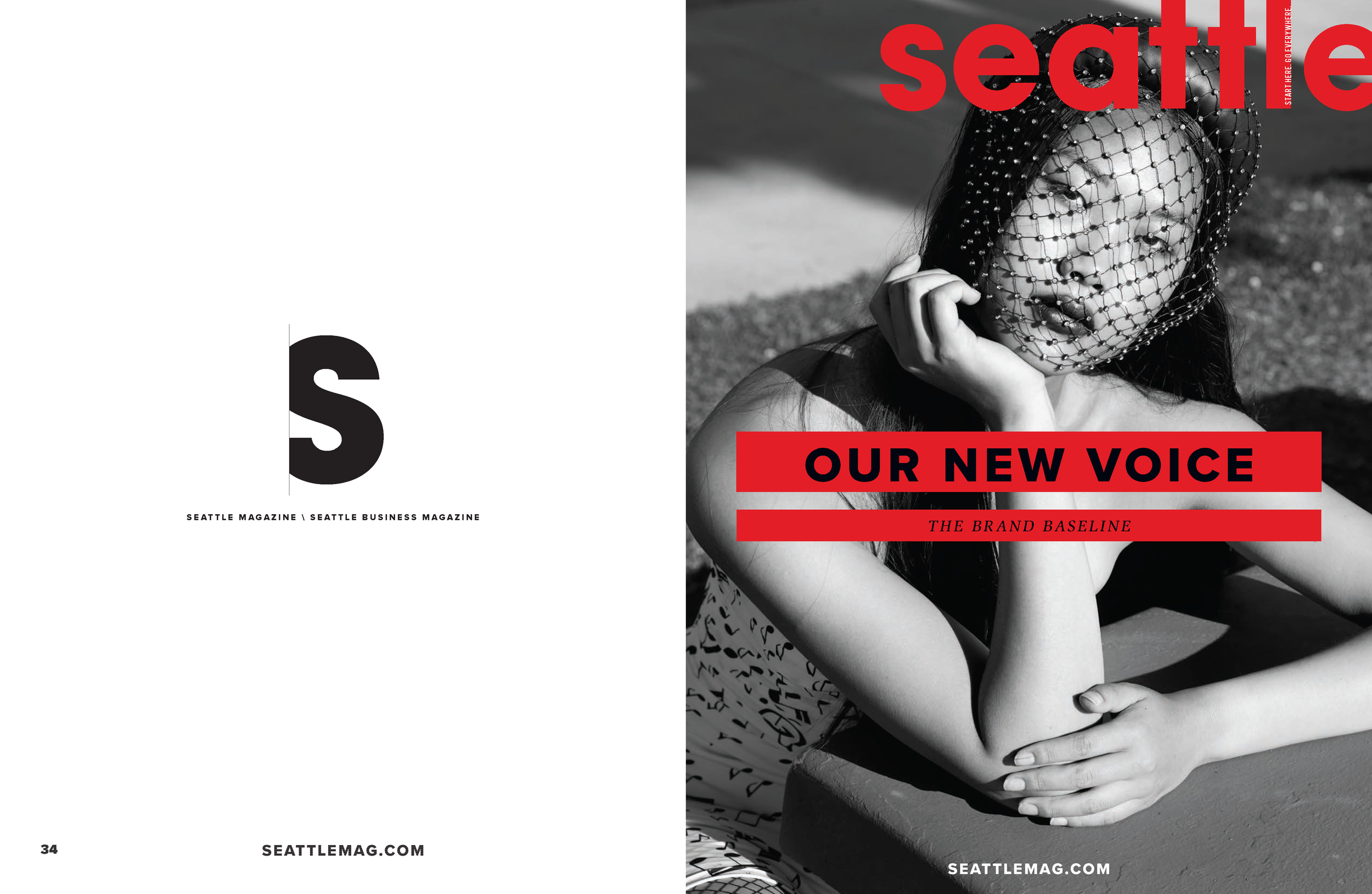
The Brand Baseline
We explored ways to revitalize Seattle magazine, focusing on the influencers in art, fashion, technology, and food who shape this city and extend their influence nationwide. Seattle magazine's new tagline: Start Here. Go Everywhere.
-
![]()
Approach
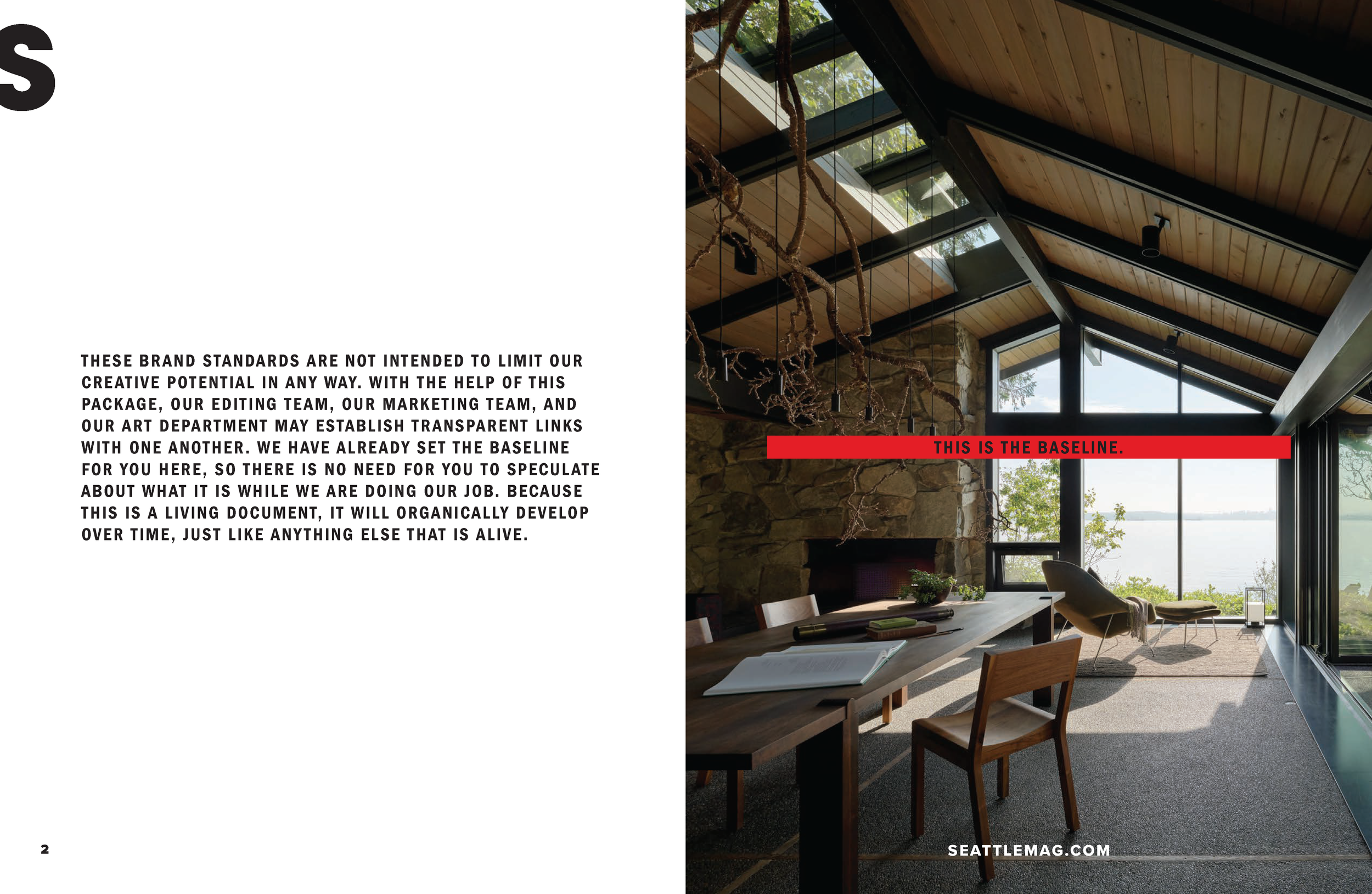
My approach for this brand was to honor its legacy while ensuring the new refresh remains adaptable and progressive over time.
-
![]()
Where the new informs the now
I revamped this esteemed publication to enhance its content presentation, focusing on the caliber of contributors and strategically positioning the aesthetics of our new refresh.
-
![]()
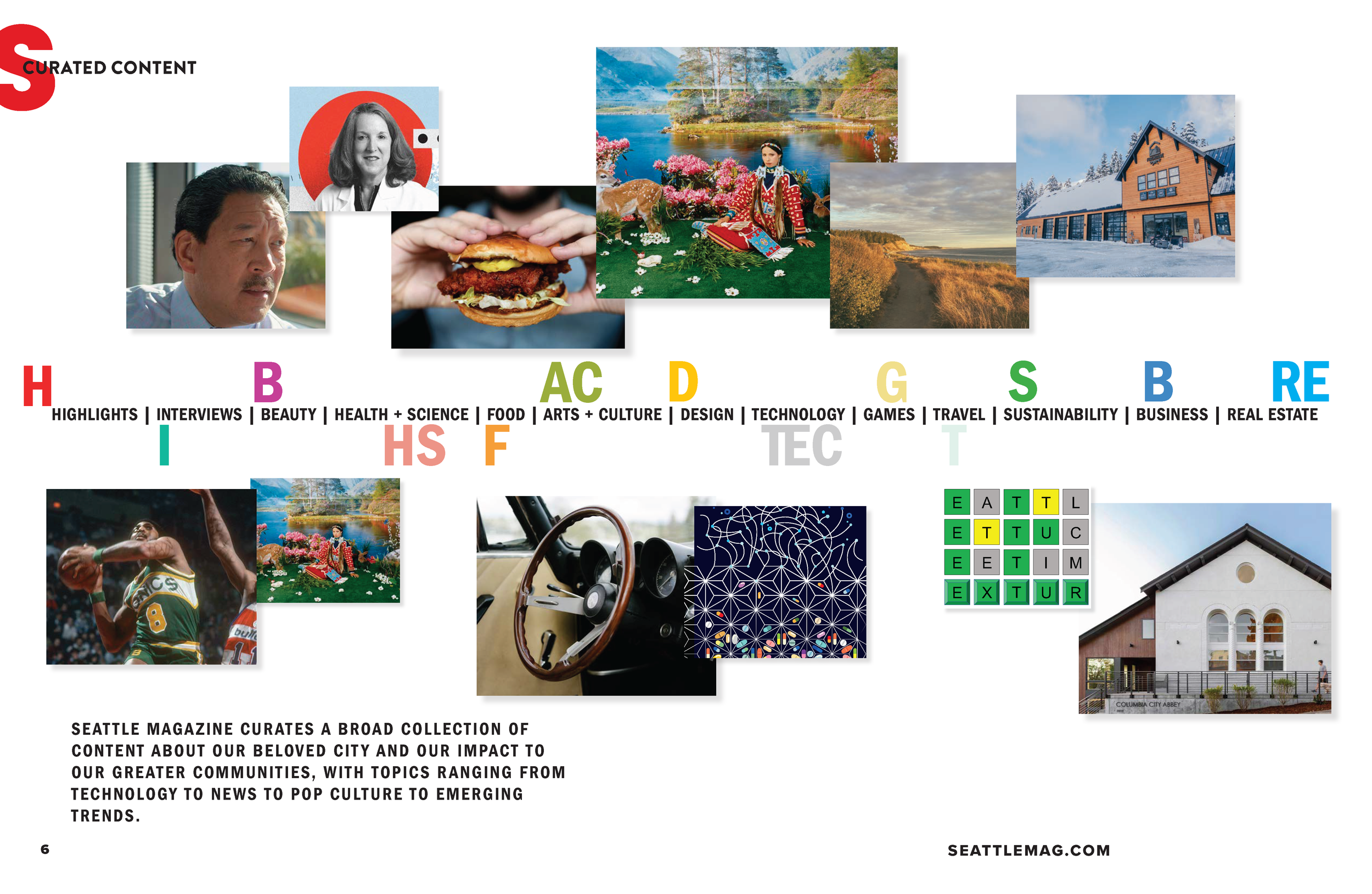
Refining our content collection
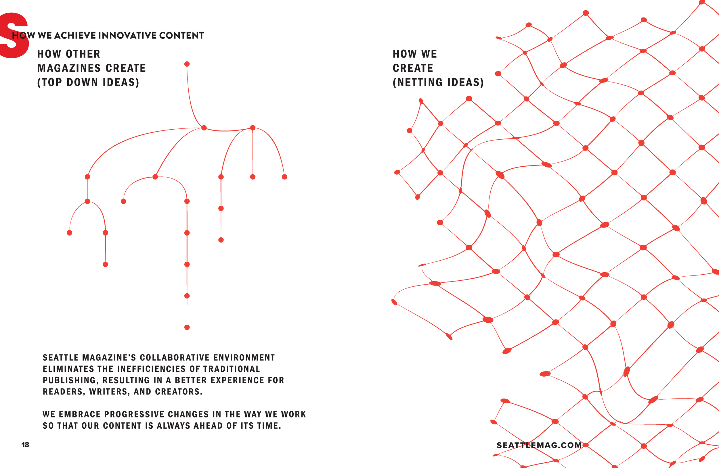
As a united team, we carefully curated topics that showcased our city's influence and impact on communities, emphasizing the historical significance and emerging trends within the city’s industries and innovations.
-
![]()
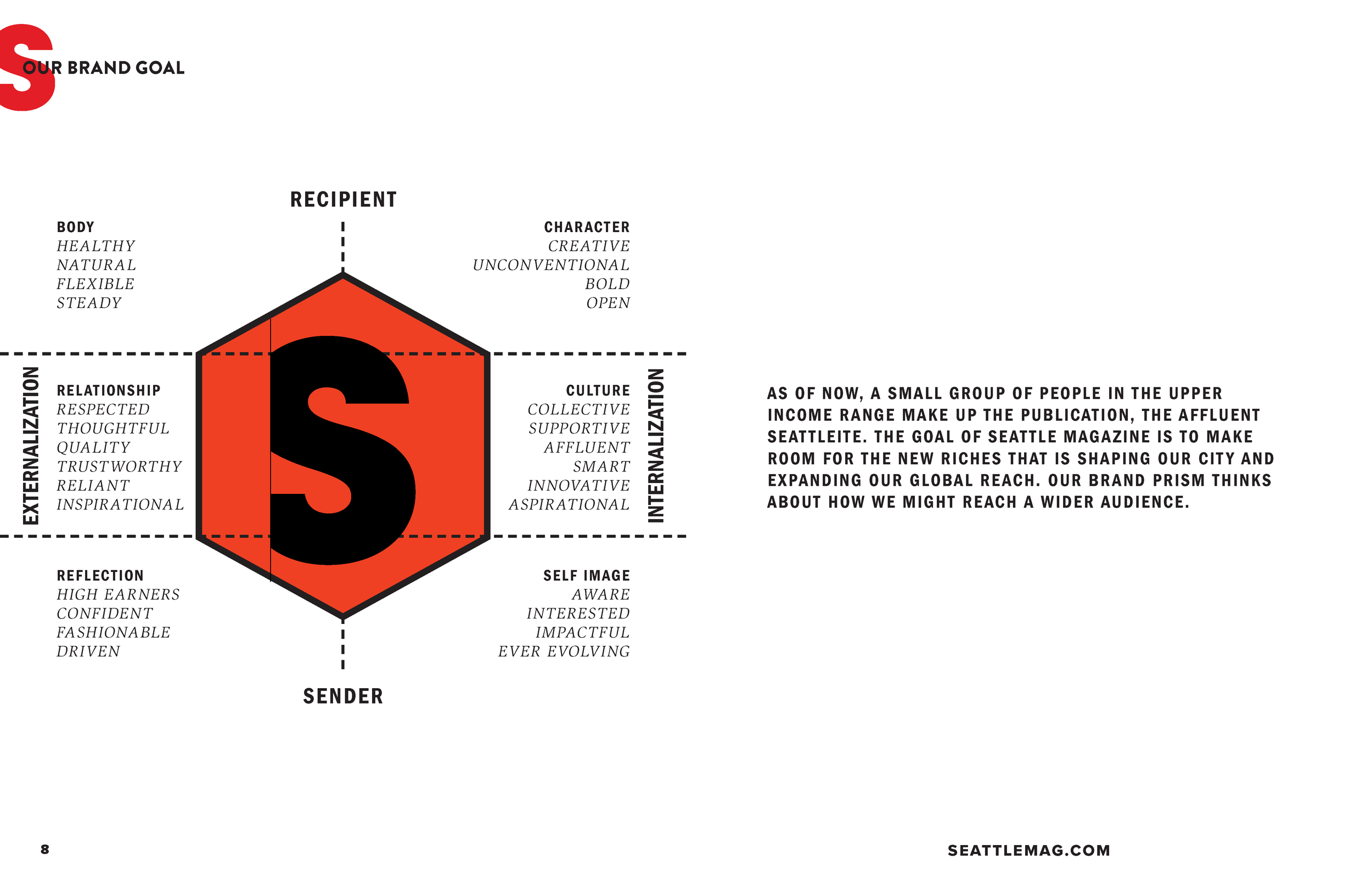
Inward and outward perspectives
I contemplated the origins and essence of the magazine, considering its evolution over time and desired tone. Our reflection extended beyond content and design, encompassing the collaborative nature of our work at Seattle magazine.
-
![]()
Statistics and current demographic
Our refresh also took into account our current audience and their interests. Recognizing the loyalty of our subscribers informs us on how to retain their support.
-
![]()
Building a new audience
In addition to our existing readership, I researched opportunities to attract new subscribers by exploring the individuals and communities that have a significant impact on our city.
-
![]()
Inclusive refresh
I aimed to refocus and highlight the diversity within Seattle's community, giving central attention to those who are driving change and making significant contributions in our city.
-
![]()
Our Brand Target
While the topics covered in the magazine are diverse, we ensured that the language of our content aligns with the new brand. Collaborating with editors, art directors, and advertisers, I refined our voice to be both bold and fresh.
-
![]()
Consistent progress
To maintain consistency in our new voice, we fostered a collaborative working environment, encouraging ideas from each team member and the communities we serve.
-
![]()
Content Positioning
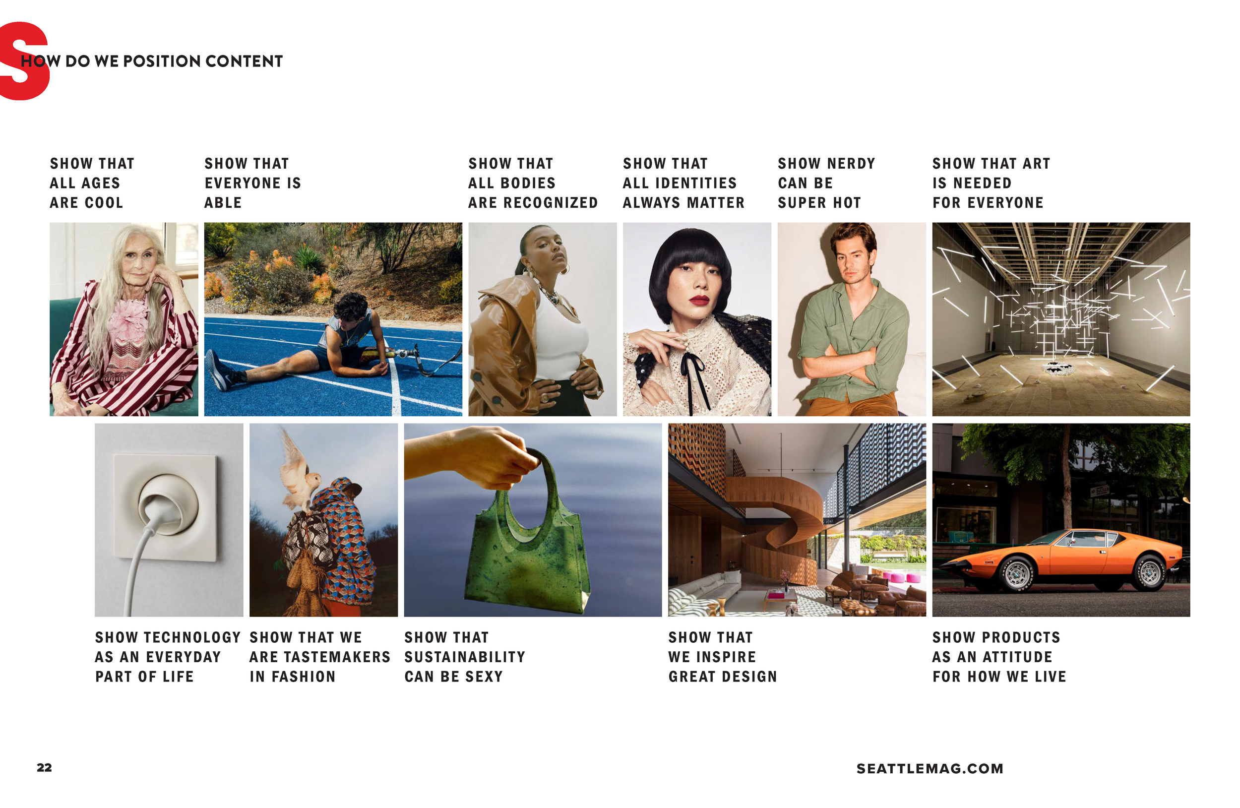
The redesign of the magazine captures the multitude of influences and innovations that Seattle has brought forth and continues to offer. Its positioning evokes a sense of fun, allure, and a cool attitude.
-
![]()
Visual Style
I provided direction for visual guidelines to ensure that the images align with our new look. It was important to evoke a variety of scales and ensure that the images are sharp and vibrant, bringing a sense of vitality to the pages.
-
![]()
Logo Family
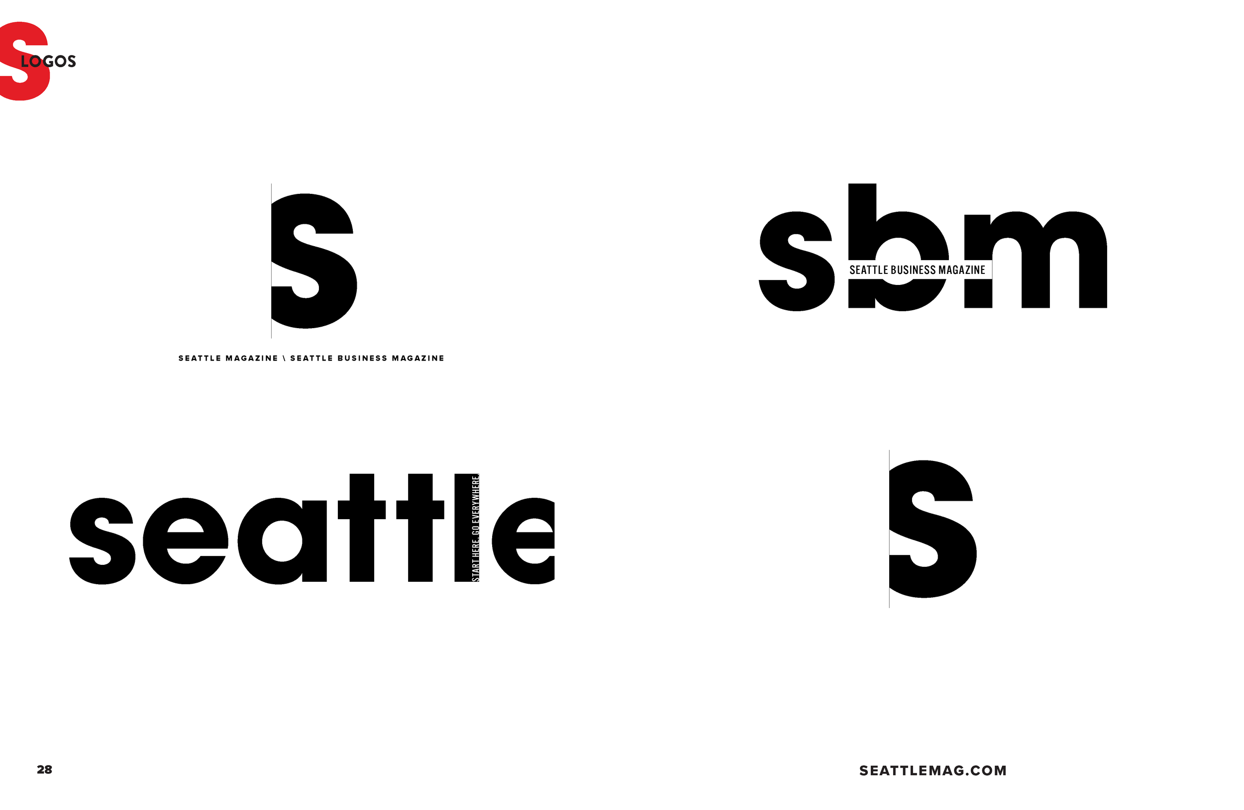
The new logo is accompanied by a versatile and scalable family that seamlessly integrates other affiliated publications under the Seattle magazine umbrella.
-
![]()
Brand Colors
To capture the diverse essence of Seattle, we selected a brand color palette that is expansive and versatile, capable of representing the various seasons and moods reflected in our publication.
-
![]()
Reflection
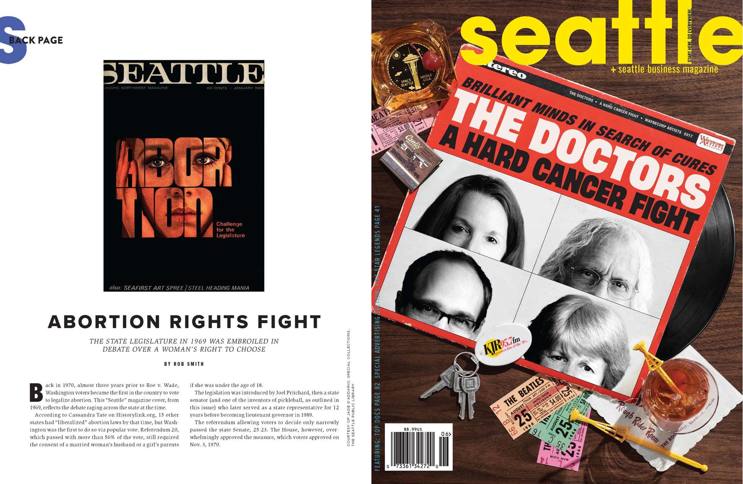
Through studying old Seattle magazines, I found inspiration to push boundaries and remind the city of its progress. By including past articles, we maintain perspective and celebrate our journey.
-
![]()
Seattle Scene
I took on the role of art directing new content, including the addition of fashion editorials to cater to our stylish community.
-
![]()
Advertising
To ensure a fresh and contemporary look for our new magazine, I collaborated with our sales team to provide advertisers with innovative and vibrant ad designs.
-
![]()
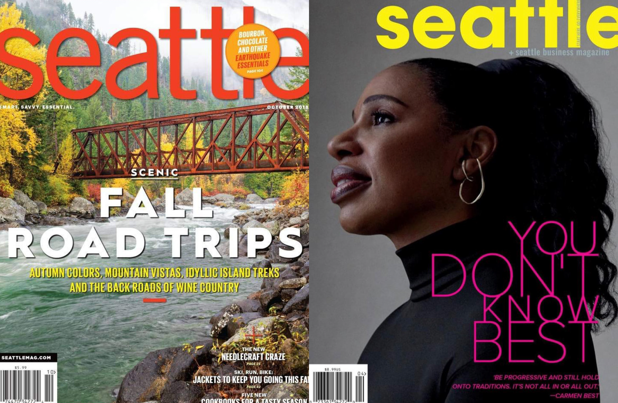
Out with the old and in with the new
An example the past Seattle magazine to the new look and feel.
Other brands i designed
-
![]()
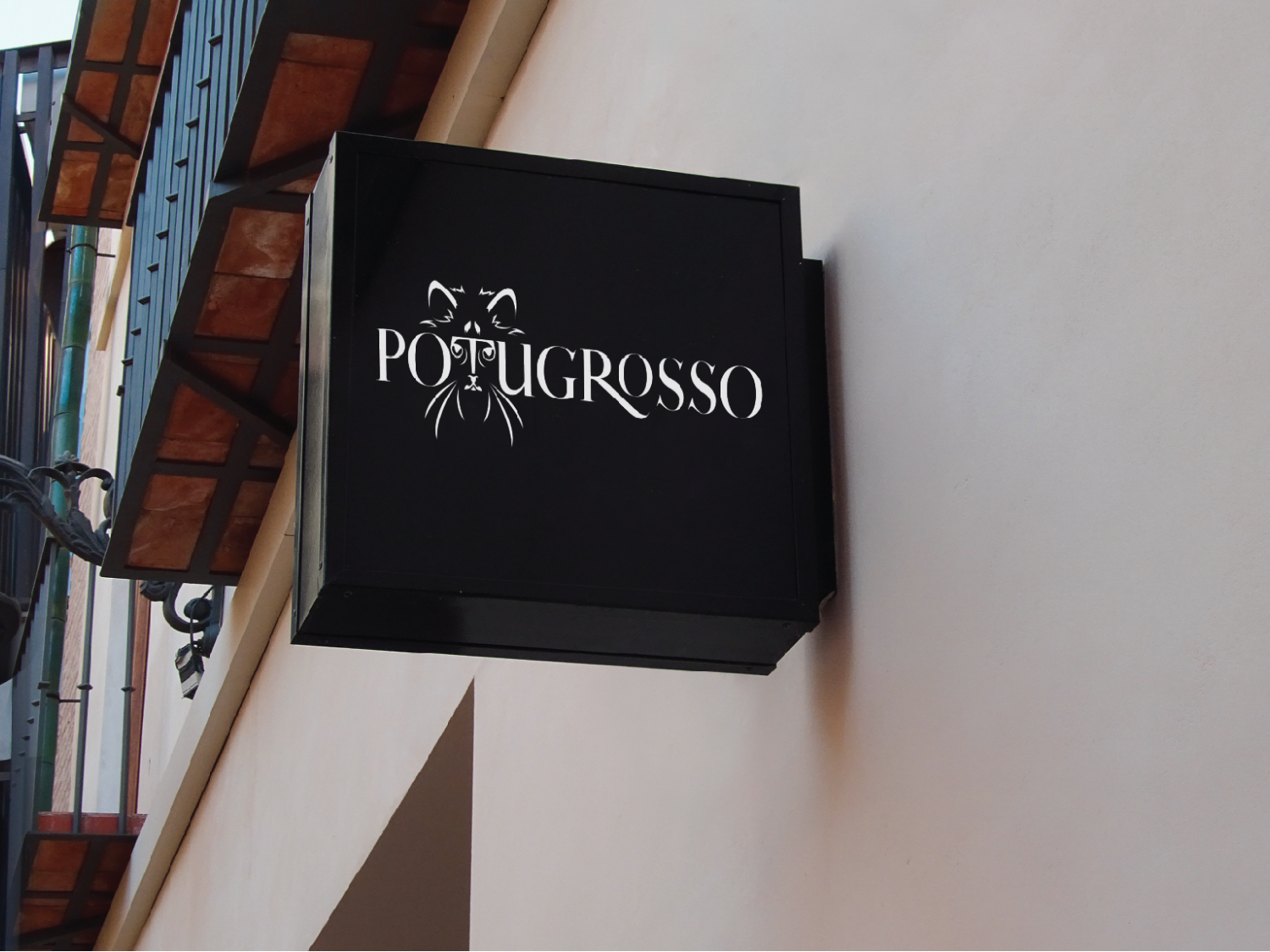
Potugrosso Cafe and Shop
-
![]()
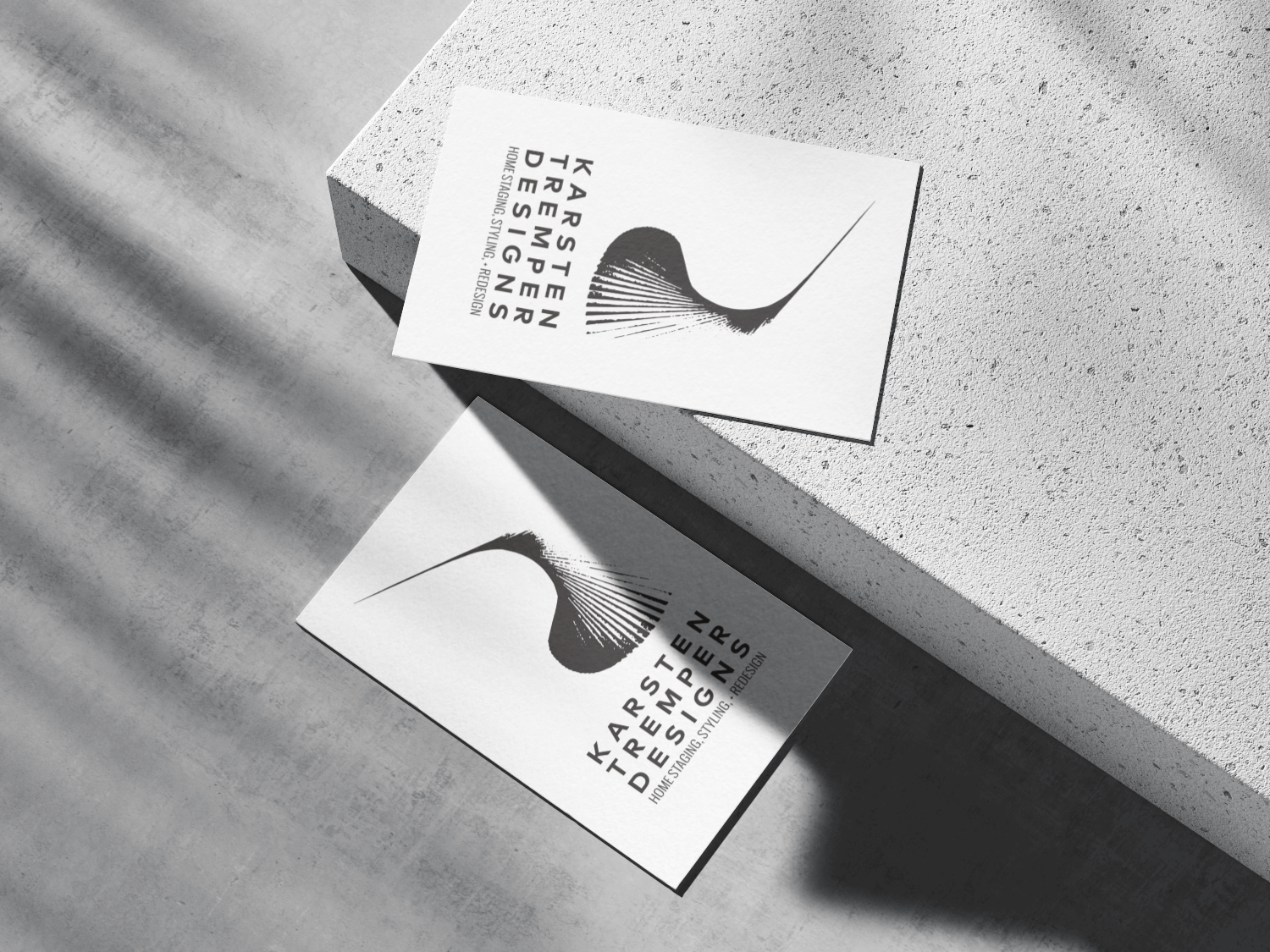
Karsten Tremper Staging
-
![]()
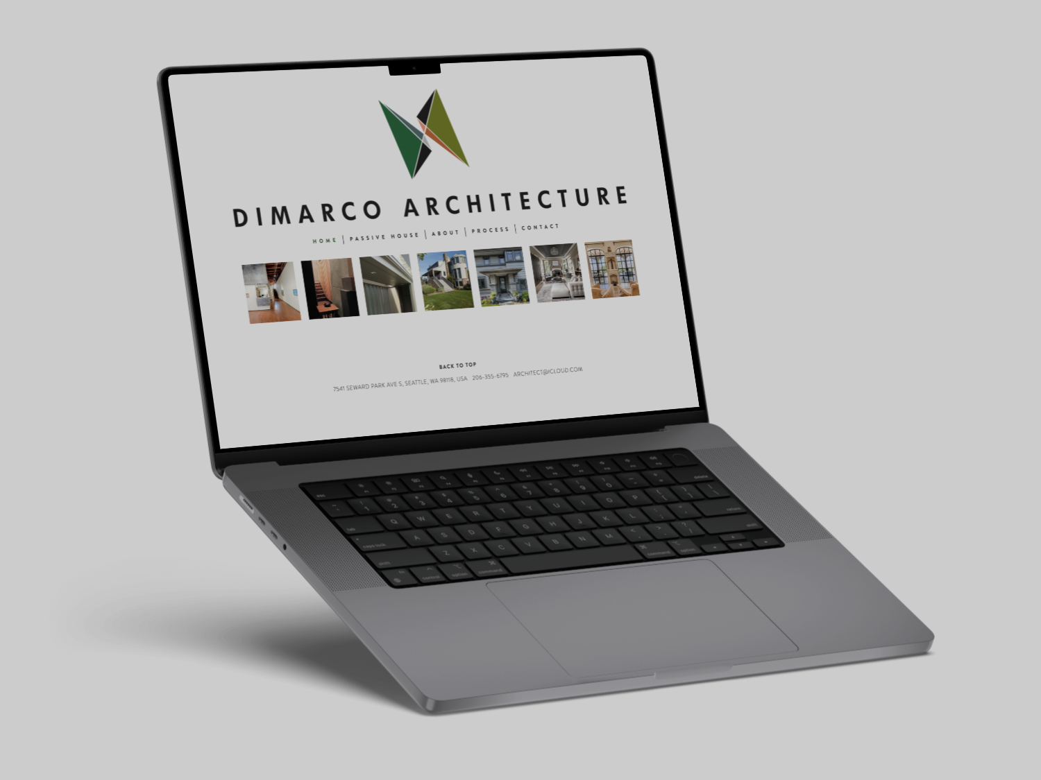
Dimarco Architecture
-
![]()
Dimarco Architecture
-
![]()
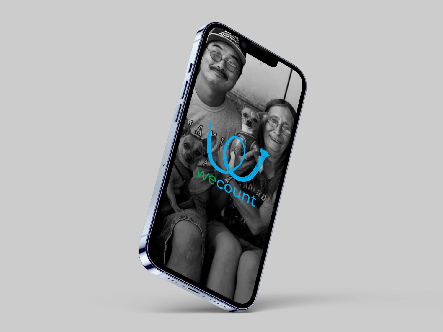
WeCount
-
![]()
Venandi Consulting
-
![]()
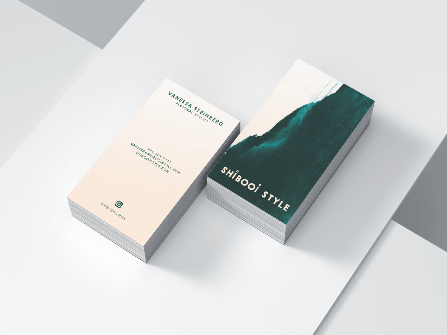
Shibooi Styling
-
![]()
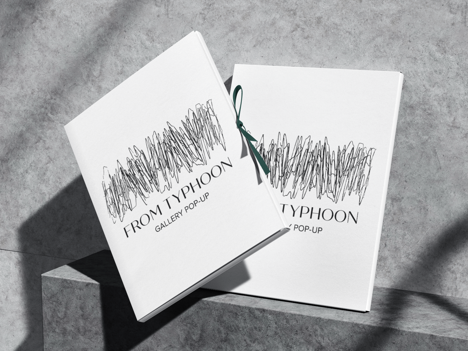
From Typhoon Gallery
-
![]()
Rofe Handcrafted
